Window Nation — Brand Refresh & Identity System
Overview
Window Nation had built a strong operational foundation — 30+ locations, tens of thousands of satisfied homeowners, and a reputation for quality installation and service. But as the company accelerated its national expansion, its brand needed to match its ambition. The existing identity lacked the cohesion and strategic clarity required to compete confidently in new markets, earn trust at scale, and unify every customer touchpoint under a single, recognizable brand voice.
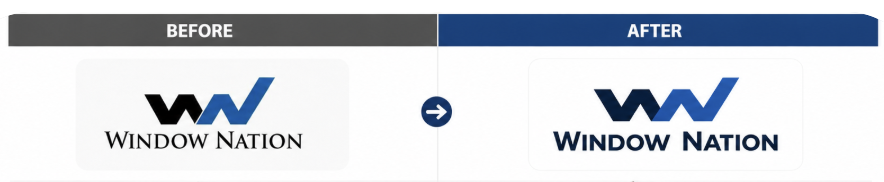


OLD Creative from the brand.
My Role
I led the strategic development and execution of the brand refresh, translating business objectives into a cohesive brand architecture that could scale. I worked cross-functionally with creative, marketing, and leadership teams to define the brand's foundation and bring it to life across every channel and market.
Strategy & Execution
The refresh began with a clarified brand foundation — establishing the purpose, mission, vision, and behavioral pillars that would serve as the North Star for every piece of communication going forward.
The Window Nation Brand House emerged as the organizing framework:
Brand Purpose: Increase the long-term value and integrity of homes for families and communities
Brand Mission: Help homeowners improve comfort, safety, and value through an easy and expertly managed replacement experience
Brand Vision: Become the most trusted and recognized national window and door replacement brand in America
Brand Proposition: Deliver a stress-free, guided replacement experience backed by proven trust, engineered quality, and long-term home protection
Four brand pillars — Seamless Experience, Engineered Quality, Proven Trust, and Home Protection — anchored the messaging hierarchy and ensured consistency whether the brand was speaking to a first-time homeowner or a repeat customer in a new market.
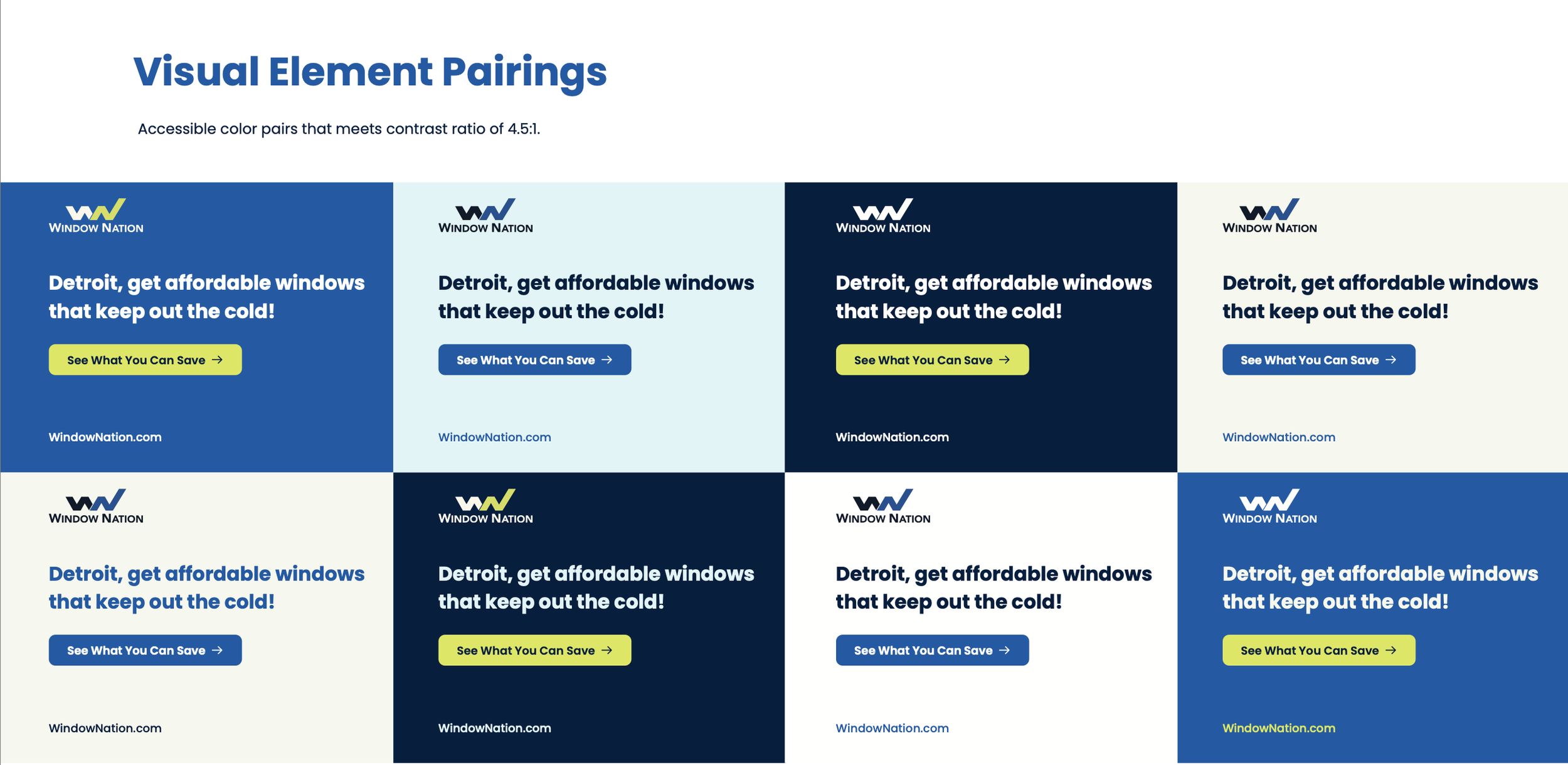
With the strategic foundation in place, the visual and verbal identity was refreshed to reflect this elevated positioning. The updated creative system introduced a flexible color palette, refined typography, and a modernized logo treatment that gave the brand a clean, credible presence across digital, social, out-of-home, and in-person activations. Ad creative was built for adaptability — maintaining brand recognition across multiple color treatments and formats while consistently delivering clear, direct messaging to local markets.
Digital Experience
As a centerpiece of the rebrand, I led the launch of a redesigned Window Nation website — the brand's primary digital front door. The new site brought the refreshed identity to life in a cohesive digital experience, translating the updated visual system, messaging hierarchy, and brand pillars into a unified customer journey. The site now serves as the connective tissue between national brand awareness and local market conversion, ensuring that every homeowner who encounters Window Nation digitally experiences the same clarity, credibility, and confidence the brand promises.
Deliverables
Brand architecture, purpose, mission, vision, and proposition framework
Visual and verbal identity system, including logo, color, and typography
Core messaging hierarchy aligned to brand pillars and audience segments
Redesigned website unifying the brand under a single digital experience
Scalable ad creative system across paid social, display, and out-of-home
Brand guidelines to equip internal teams and agency partners for consistent execution across all markets