
Case Study: Olive App

Olive App Overview
The goal of the project is to allow health-conscious individuals to log into Olive a responsive health and wellbeing portal to record their health and medical information, and access general physical and mental wellbeing features to help them keep track of their health.
My role: UX/UI designer, User Researcher
Timeline: April to September
The Process: Competitive Analysis, User Stories, User flows, Wireframing, Prototyping, User Testing, Card Sorting, Personas, Design Language.
The Problem to Solve
Problem Statement
Olive users need a way to store their health information and find ways to keep their health on track so they can eliminate the confusion and stress of finding custom information related to them. We will know this to be true when we see when the users are consistently using the app for all their health needs.

List of Possible Problems
Users are using a variety of tools to store their health information but don't have a single app that can do it all.
They don't have an app that is customizable to their health providing them useful information regarding their health needs.
They need a reward system that will allow them to know if they are going in the right direction with their health needs.
They aren't sure if a Health app is safe enough to put their Health information in-app.

List of Possible Solutions
Provide an app that will customizable to the individual needs of the user so they can stay on track and reach their goals.
Allow the users to set up goals or use the inside app goal system to keep the user motivated and focus.
Every Quarter allows the user to get a summary of their wins and some possible next goals.
Allow the user to decide what they want to share or not share to reach their goal.
Conducting Research
Competitive Analysis
I Conducted a competitive analysis between Apple Health and Fitbit. These two health apps are two of the most popular used health app among users. During my competitive analysis, I was able to discover their strengths, weakness, opportunity, and threat. These opportunities allow me to find ways I can create features that stand out among the crowd.
Opportunities
It would be great to see if this app could pull information from other apps to get personalize and a more 360 approach to someone's health this includes the current appointment apps like zoc doc, doctor portals, and other similar apps.
It's missing the ability to add your health information or even share your health with your primary and other doctors.
Having a space where you can ask an expert a question about your health and you can get a quick response or see other similar answers.
There should be a series of questions that could be asked before using the app that could help create more personalized data for the user.
understand the User
User Persona
User Journey
Below are my initial user journey based on each personas needs and goals.
Robert wants to be able to quickly see his appointments, reschedule or even cancel his appointments without going through a bunch of different windows.

Samantha wants a quick way for her to get more customized workouts and focus on things that matters and is related to her life.

Both us will need to setup their account and be walk through onboarding to get started with looking at their information on the dashboard.

Card Sorting
To get a better understanding of how users group certain features together, I conducted a card sorting research with 5 participants.

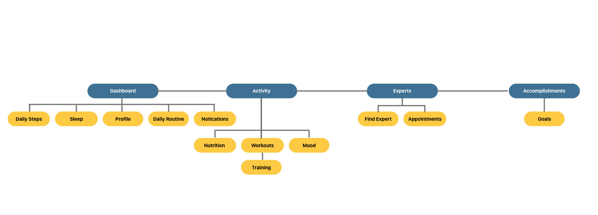
SITE MAP
After putting each feature into sections, I went back again and fine tune the features a bit to simplify them and focus on the sections that are the most critical the our users and their current problems.
Feedback
Usability Test
Goals:
The main goal is for a new user to have clarity of what the app is all about, can they easily navigate through the app, and complete and go through the entire app with little or no questions.
Test Objectives:
See how easy it is for the user to book a new appointment.
See how easy for them to view a workout.
See if the user feels the app has enough options to access them and their health.
See if the user understands what the app is all about and possible what additional features would they like to help them get great health.
Observe how the user nagatives the app and see if there are any errors they come across.
Methodology:
Moderated Remote/In-person: I will use a combination of both in-person and virtual methods to conduct the testing to be flexible for people who dont want to meet in person because of covid.
Participants:
I will test 6 participants who are family and friend members who I will reach out to. The majority are into their fitness but I will be testing a few who are moderately into working and health.
Analysis Results with Rainbow Spreadsheet & Affinity Map
After testing was concluded I recorded and analyzed the results using an affinity map and rainbow spreadsheet to gain a better understanding of what the friction points were and the next steps I needed to take. Here is what a few people had to say.


What I learned
Key Visual Changes

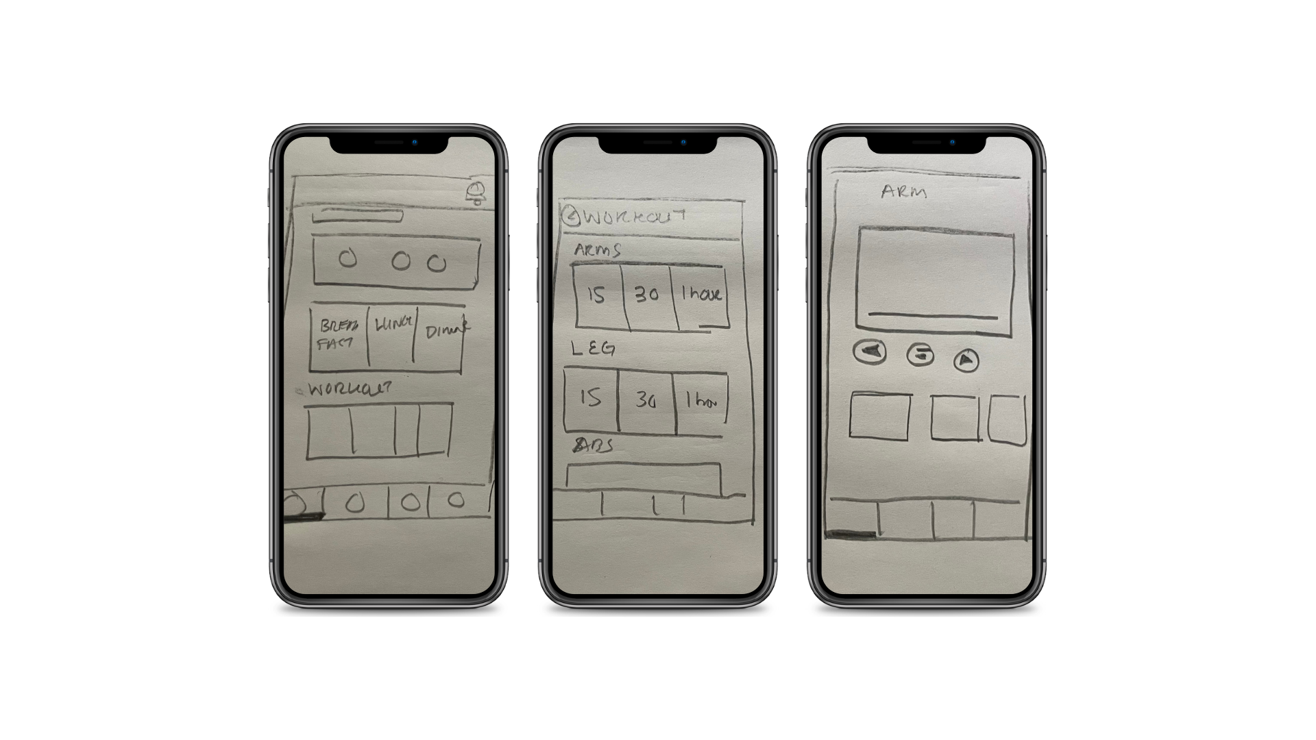
When the users were done booking their appointment they did not know if their appointment was confirmed or added to their appointment. Users were confused about how to play and stop a video and rewind (Medium)
Suggestions: Separate the most recent booking and make sure to give the designer notes to make it stand out design-wise so the user will know their appointment is confirmed.
Add play, stop, rewind, fast forward and other related buttons for users to know how to play their video
6 or 6 participants felt this way
Back Button and Text Box

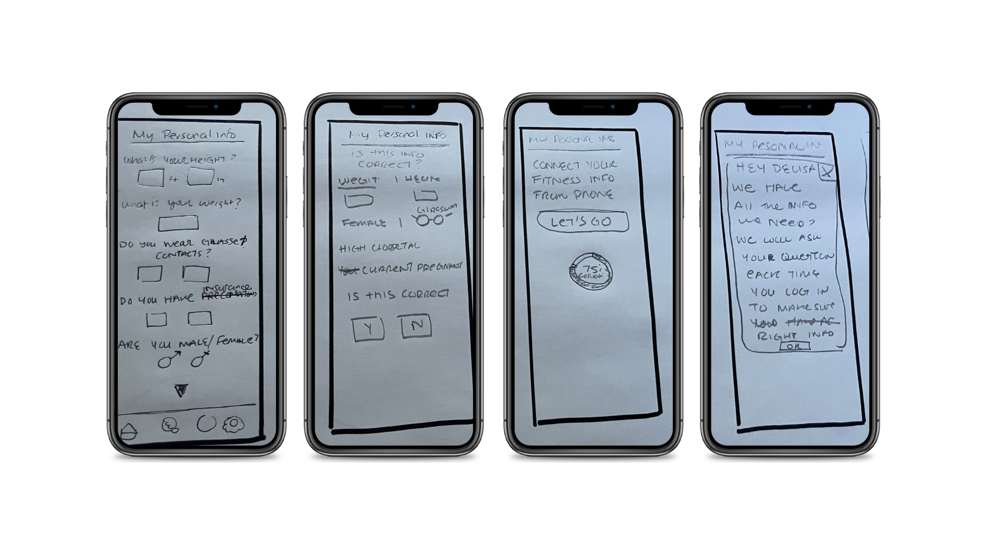
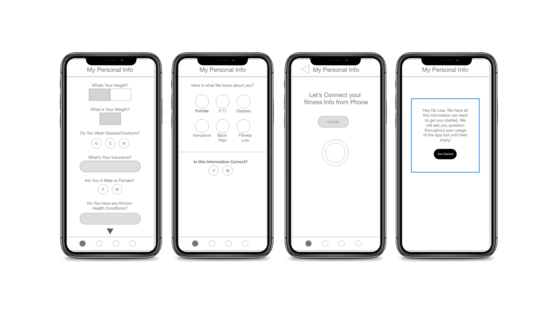
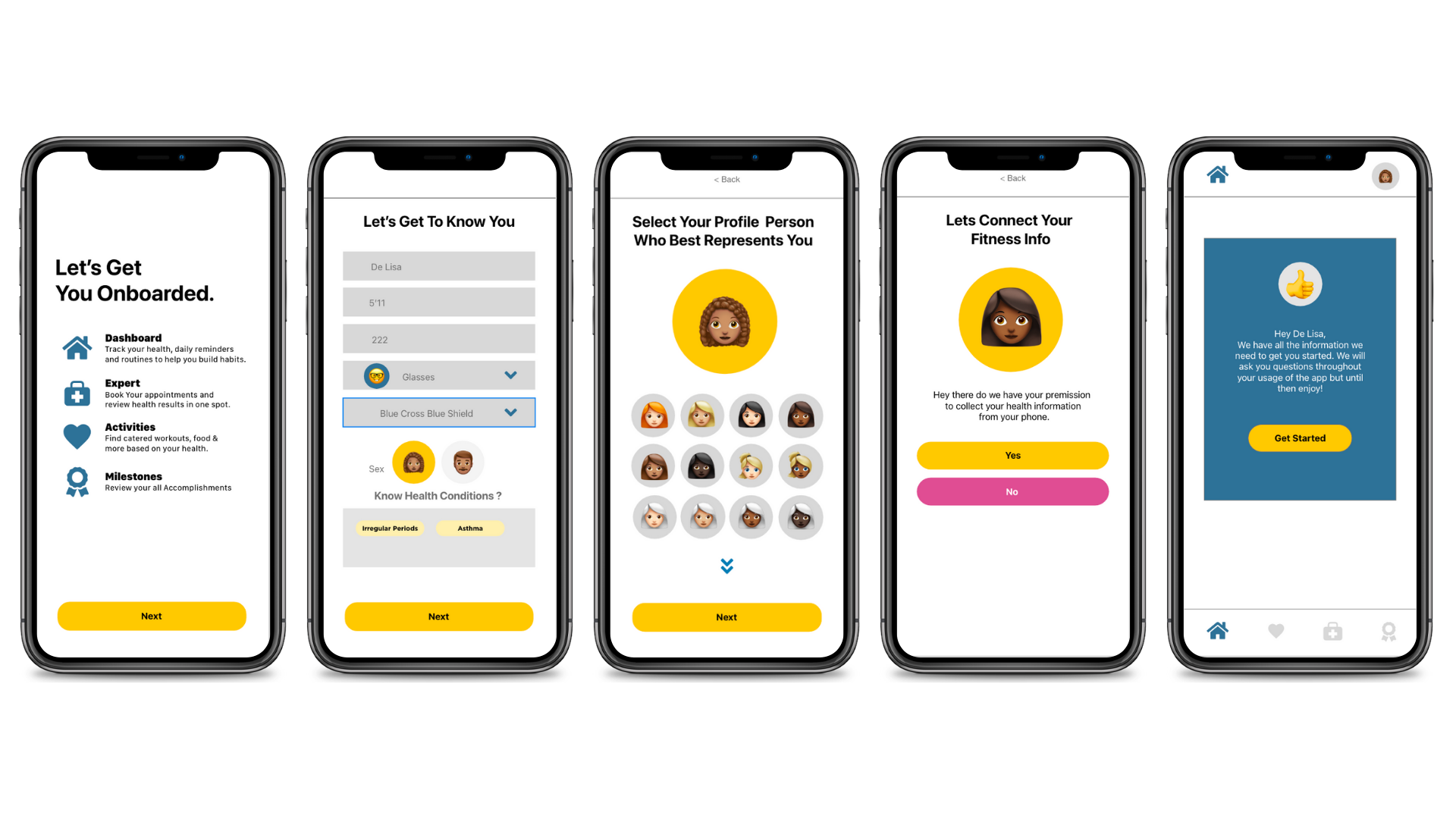
Throughout the task, users had problems going back and weren't sure how to do so (High). The users thought that the Height and weight section was a slider and didn't know how that would function(medium),
Suggestions: Instead of having a symbol use the word "Back" to make it clear this is how they go back to the previous back. Replace the box with a text box
3 or 6 participants felt this way
Checkbox Vs Textbox

The users felt that there are too many options for systems and did not like the fact they would have to scroll to find their systems or skip this (low).
Suggestions: I would have a text box being shown that allows the users to add as many as they want.
2 or 6 participants felt this way
Design Language

Visceral Level
Using yellow has a positive and happy feeling that is conveyed. I want to use this color so that it can invoke a happy feeling when they are making decisions.
Blue conveys trustworthiness and invitingness because working on your health can feel intimidating but I want the user to feel like it’s welcoming.
Lastly, I am using the pink color only when there needs to be a change or a mistake because it’s supposed to invoke a soft feeling instead of using red that can feel alarming.
Behavioral Level
When a user reaches a milestone they will get rewarded and by doing so they will take action on continuing to take steps towards their health.
Reflective Level
There will be a profile page that will allow users to see how far they have come and I believe when people see how far they have come they are most like to continue to work towards their goal

Here is an example of our Grid system

This is how users can expect to see our design element used throughout the app.

Here is another example of how text is used based on the standard indicated for IOS users.
Refinding Design
Designing For Accessibility

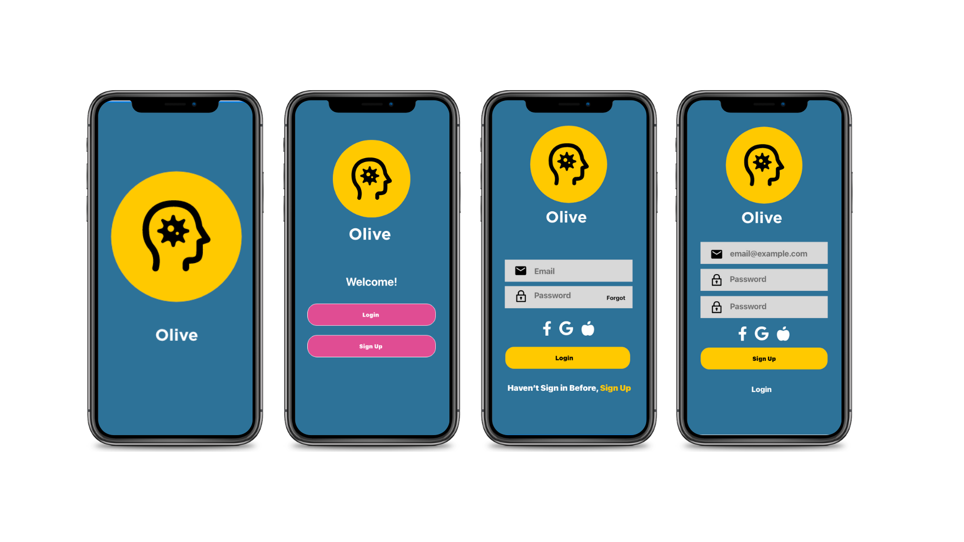
Throughout the app, I am going to fill in the forms so the user will understand what they need to include to get the best outcome. For example, I can add an example of what the email should be.

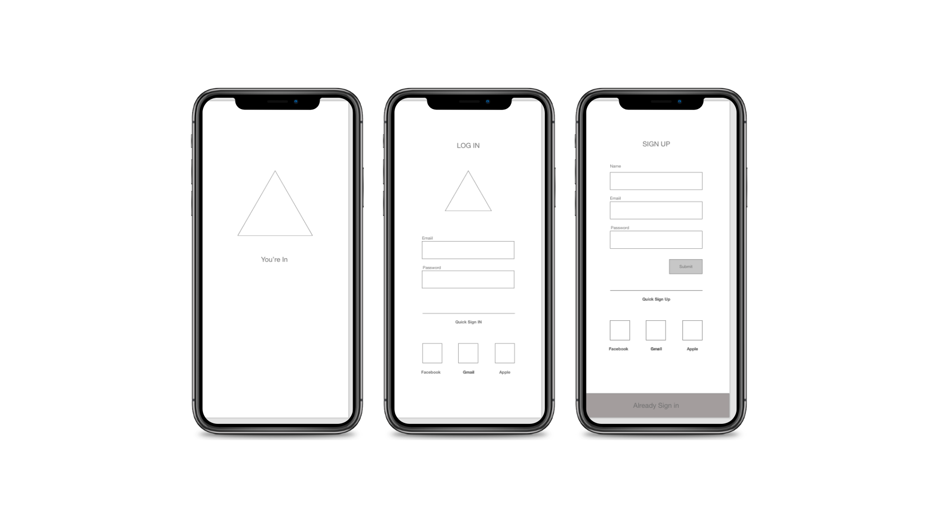
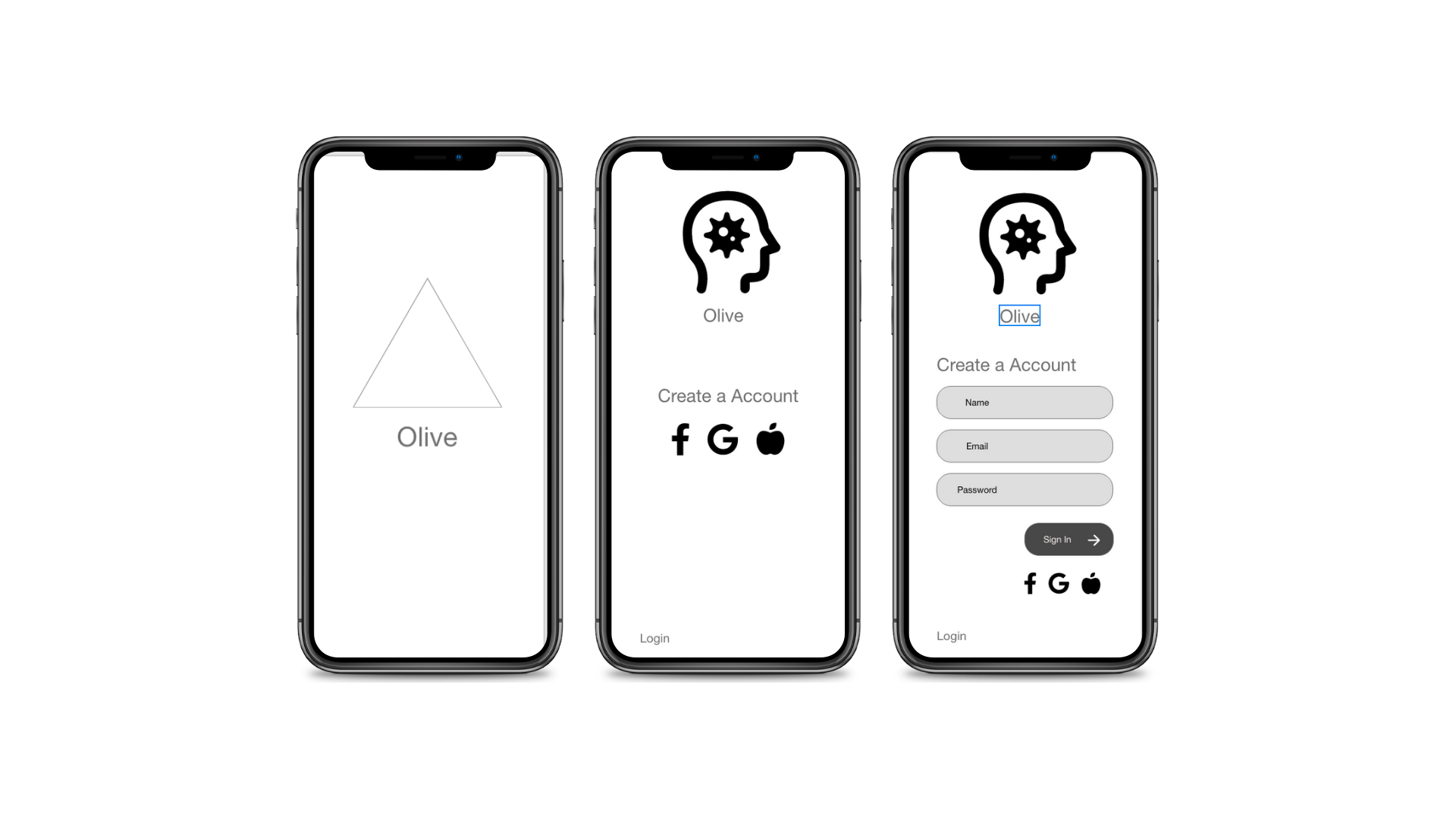
I originally used what I thought was a triangle that pointed to the left to indicate the user to go back however many users felt this was a play button and often got stuck when asked to go back. So I replaced the triangle with the word back and the less than symbol to make it clear this is how they go back.

I will make sure that all alerts are the color pink to convey that the information is important and the user to focus on that information. Usage of gray will be used for background colors the elements that are not as important so that blue or yellow can convey the most important information.

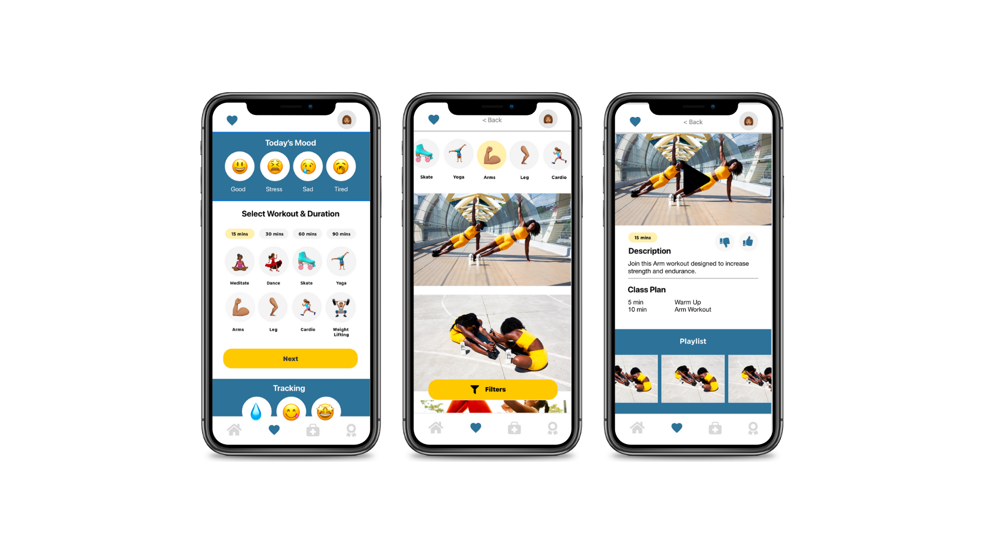
When I had the icons/emojis I did not included the words to describe what they were but now placing them in it will help users to understand what workouts they are about to click on.
Prototyping
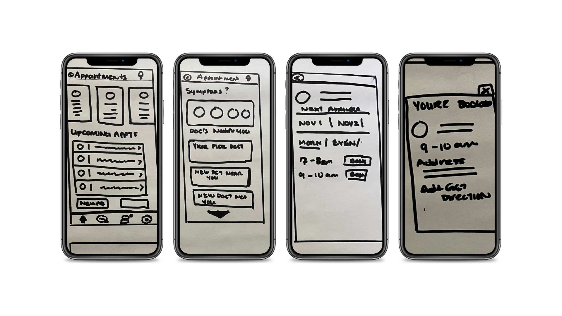
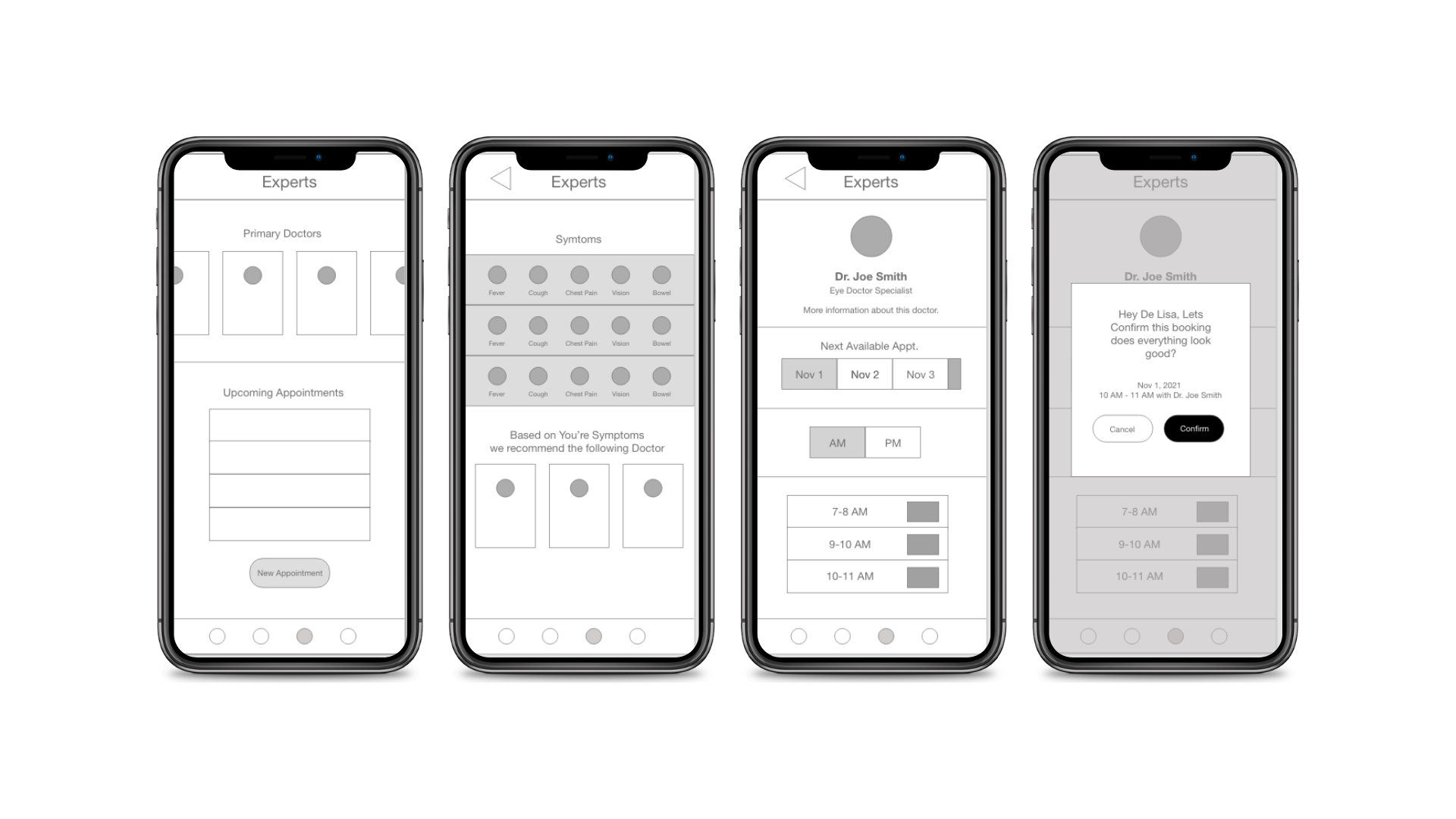
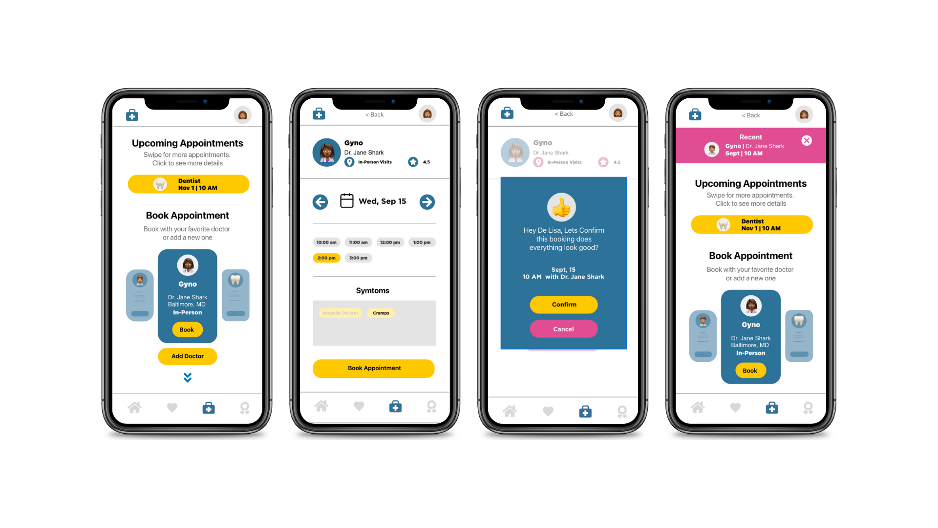
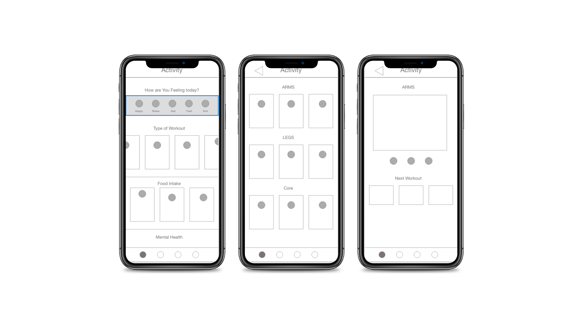
Throughout the process, I have done iterations of prototyping, starting off with paper and pen (low fidelity) when I was doing some research on how a typical screen would look like for each sections. Then once I got some user research, I was able to create a mid fidelity prototype where I would test out the usability of the app and get some key insights on what will help the function well before going into UX/UI design. Lastly, I created the high fidelity prototype once I had some clear direction on the style, function and user feedback from the previous prototype I was able to place design elements to create the most recent design. Below you can see the changes I’ve made overtime.
Next Steps
As I mentioned in the beginning there were some features that I had in mind, I wanted to incorporate, however, going back to the problem and feedback users have provided I decide to prioritizes other features first. Below are some next steps:
Adding a community feature where users can communicate with their friends or meet new friends to keep them motivated and focus on their health.
Add a feature where they can scan their insurance information so they don’t have to type it all in.
Add a more robust intake section where the user can not only put in what they ate but have customized food ideas based on their health.
I will continue to test how to get users to stay motivated and what other features users would like to have.